


Sweet Beginnings: My partnership with Moms Bread Co.
A journey of creativity and collaboration.

The journey to Moms Bread Co, a beautiful and new bakery in Albert Lea started in October with an email and subsequent phone call from Katie Erickson. Katie and I had met at the Summer Garden Party I hosted last June. She was an expert mimosa server that day for The 112 on Broadway!

Katie explained that she and Brent had recently signed a lease for a downtown space and she was opening a bakery. She asked if I would help her with the design of the bakery and it was an immediate yes from me. Vintage Paris bistro. Those were the keywords from that initial phone call. I knew it would be a fun adventure! I was thrilled with this design opportunity, but Katie continued and said that they’d like me to have items for sale at the bakery. So kind!
This was the inspiration picture for how Katie envisioned the bakery.

I was familiar with the space and I knew painting would be at the top of the to do list. Warm white was the direction we headed. Armed with a lot of Samplize swatches, we chose Benjamin Moore Sailcloth They quickly got to work painting and it paired beautifully with the dark wood trim and wood floors. It also made the brick border and dark painted tin ceiling, which had been previously painted dark, pop.
Going back to our Vintage Paris bistro keywords and inspiration photo, I quickly started to build a file of ideas.


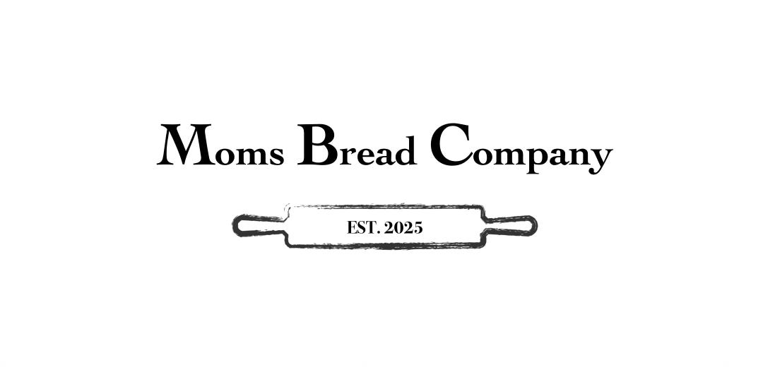
Without knowing that they’d finalized their logo, I sent this idea:
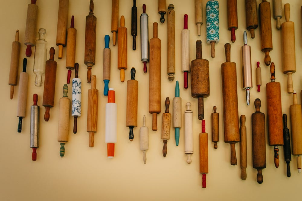
And received this in response - project rolling pin collection was on!
I had these images in mind when I would shop estate sales, thrift stores, or peruse Facebook Marketplace. When I saw this dress form on Facebook Marketplace, we got so excited and decided she needed a name. Meet Mabel.

Katie and I each saw these shutters listed online and wondered if the greenish black vintage goodness might have a place here. Then I remembered an idea I’d saved on Pinterest many years ago which we loosely followed; I love it when a plan comes together!


The table and chairs from the former tenant were in great shape, but the upholstery pattern didn’t fit the plan. Katie knew she wanted a striped seat. We knew it needed to feel casual enough for the use it would get at breakfast and lunch but feel sophisticated enough for fine dining events. We loved how this stripe started to anchor the space - we loved all the white, but the touch of black provided some magic.


When I found these copper kitchen utensils at an estate sale, we knew we had our accent color and a direction to go for our baking pan wall.


It wasn’t just me on the search for the perfect items - Katie found some amazing display shelves, bread racks, and bakery case. The antique bakery case was perfect as it was, but the others needed some paint. To add interest, Katie wanted to wallpaper part of the back. She found the perfect wallpaper and we matched the paint to it.

Fresh off picking the paint color for the display shelves, I found this darling secretary at a thrift store (and take a peek at the cute pink interior!).


The same day, the same store had the perfect vintage farmhouse table.


While I was out shopping, Brent was busy hanging bistro lights at the bakery and they added the perfect warm light and are so charming! The transformation really felt to be underway when the painting had been completed and the lights were installed.

As the great rolling pin collection rolled along, it was fun to think about where and how we’d hang them. This was my rough sketch. I’m creative, I’m not an artist!

...stay tuned for part two coming next week!
Stay connected with The Key and Co by subscribing to our Substack newsletter and following us on Instagram. Join our community to receive the latest updates, insights, and exclusive content.
